We love featuring our Senior Designer, Paul Lukes. Check out his experience designing for FoCoMX! — Bonfire Editorial Team
The opportunity
For music loving creative people, it’s not every day that you get to work on a project that really ticks all the boxes for you. So when Bonfire Effect got the opportunity to create the theme and subsequent brand for the 2026 Fort Collins Music Experiment (FoCoMX), we jumped at the chance. We were so excited at the opportunity that we not only took on the project but also became partners/sponsors for the event. FoCoMX and the organization behind it, Fort Collins Musicians Association (FoCoMA), both have missions and ethos that fully align with who we are at Bonfire, so it was a no-brainer. We’re passionate about community building and every single one of us is a music lover. Working with the FoCoMA team on FoCoMX was a great way to live our core values as a company by spreading contagious love, letting go and having fun, and being fearlessly creative in the work we create.
The problem
In past years, a single artist would create a poster design for FoCoMX, which would then inform the rest of the theme and branding. We knew this would most likely demand a much broader brand system than a one-off poster. So right away, we thought beyond the singular poster to what the full brand system would look like and the story it would tell. We approached the project as more of a brand campaign built around a unifying theme that helped tell the brand story through multiple touchpoints, assets, and implementations. We knew we wouldn’t be designing every single asset, but we wanted to build a system that was modular and as easy to implement as possible for the FoCoMA in-house design team. In addition to taking things a step beyond a poster design, the clock was ticking and the time to start promoting the event was close. So we had to work, and work quickly.
The solution
We at Bonfire Effect have some pretty well-established processes for coming up with campaign ideas, so we leaned on our training the same way a Navy S.E.A.L. would on a mission. To align on the theme quickly (and leave plenty of time for creative execution), we started by sharing three distinctly different concepts in rough sketch form.
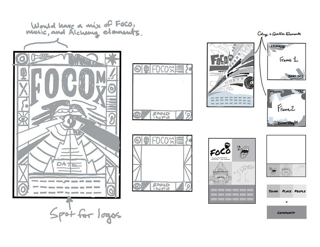
The first direction was a collage/graffiti-style approach revolving around the idea of a perfect “mix,” using the collage as metaphor for the wide range of musical styles, people, and all things creative at FoCoMX.
The second direction was a magic, musical “apothecary” concept where people can “make their musical wish come true.” This concept would be custom illustrated in a retro, slightly psychedelic style like 1970s rock posters, but with a modern twist.
The third and final concept focused on sound, place, and people and was centered on a rigid grid system, blending these three elements in a unique and interesting way.
After a lot of discussion and brainstorming with our team, FoCoMA decided the clear front-runner was the magic “apothecary” concept. It had the most depth, richness, uniqueness, and best potential for telling the brand story consistently across every touchpoint. At FoCoMX, both listeners and artists get to “make their wish come true,” whether it’s hearing any genre they want or performing on stage, often for the first time.
Execution
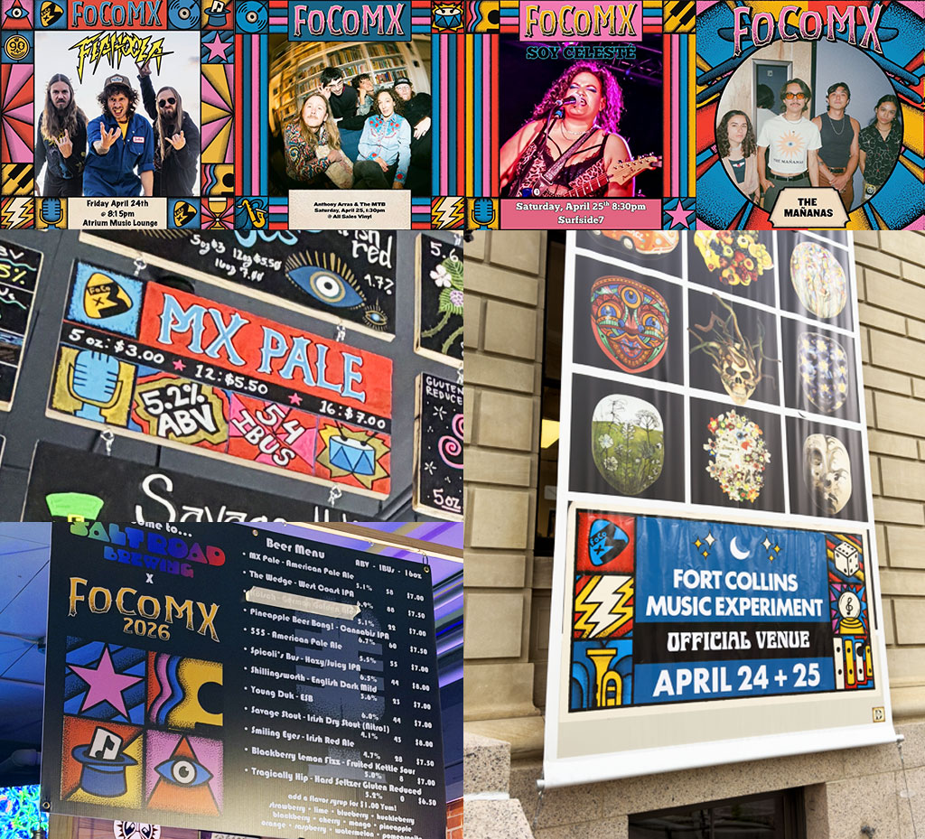
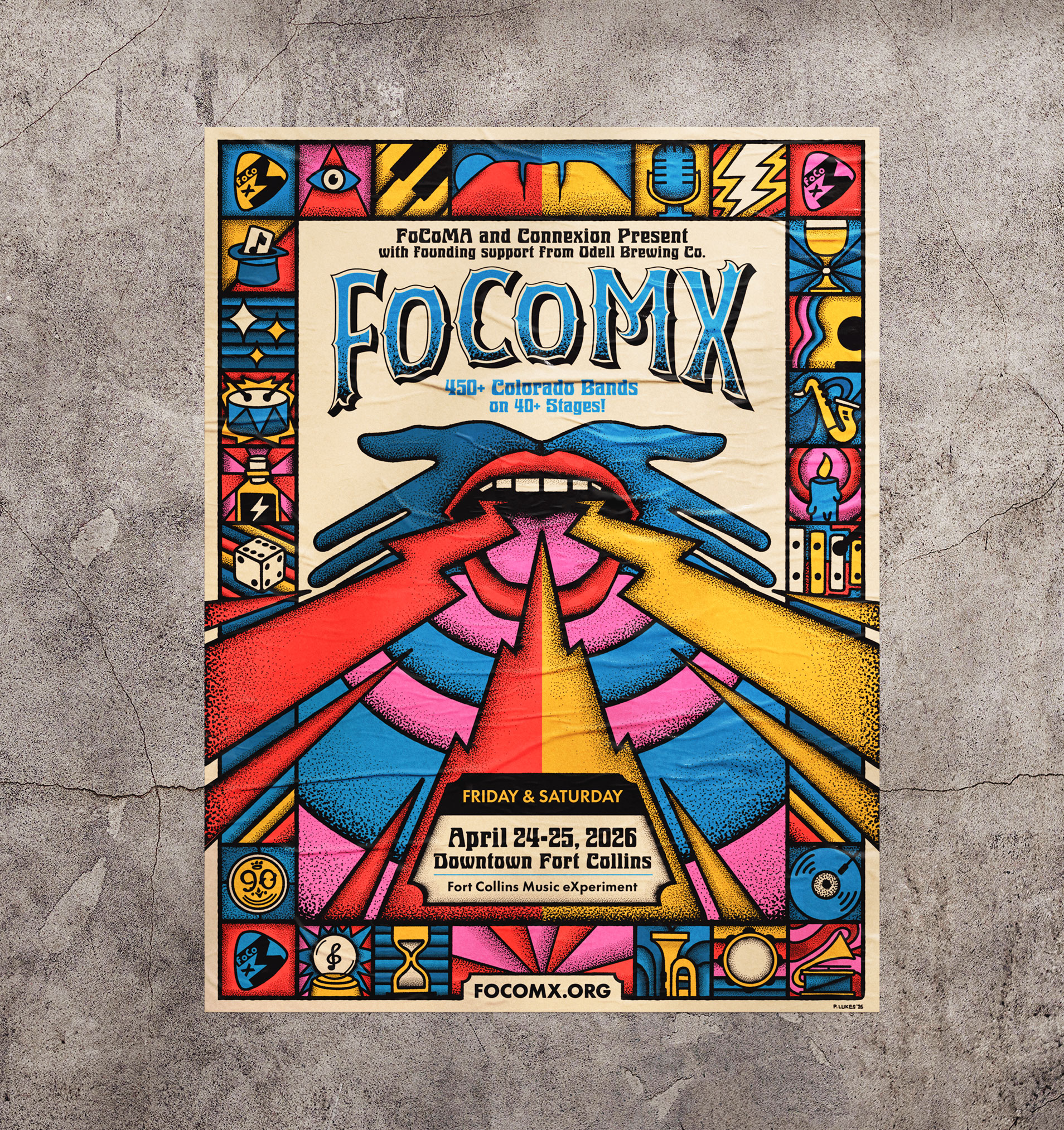
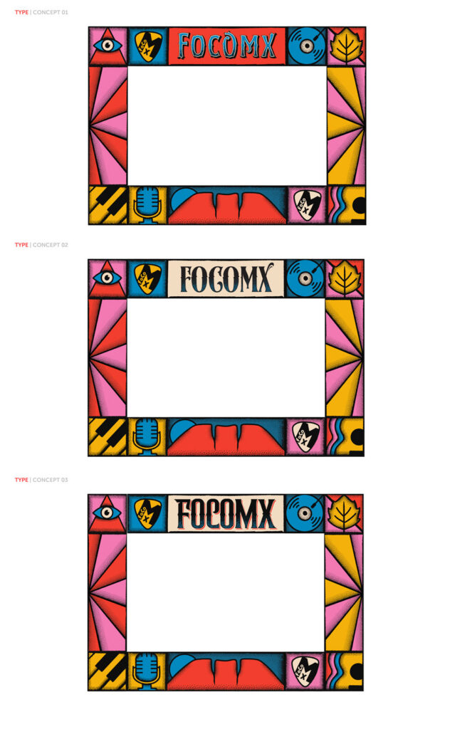
Because this project was a custom illustrated piece, we had to be strategic about how we approached the work and built out the system. There was no time to waste. Starting with the urgently needed posters and social media image assets, we created the design to have a modular frame made of smaller square illustrations, building a system that could be applied to any deliverable from there on out. This approach made it easier to create the work in smaller chunks and provide the FoCoMA team with assets they could start to use and implement on social media and other promotional channels right away.
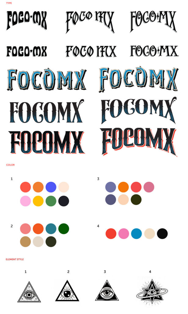
After first dialing in the styles, overall theme, messaging, typography, and color palette with the FoCoMA team, we started creating the individual illustrations that made up the modular frame design. Working closely with FoCoMA, we made sure every element spoke to the magical, mystical theme, as well as iconic Fort Collins landmarks and the general love of music. The final frame ended up being a fun mix of mystical, musical, and geographic elements that came together to tell the story of the magic that FoCoMX brings to Fort Collins one weekend a year.
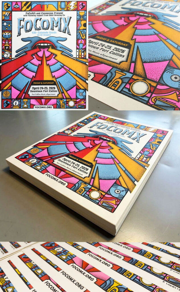
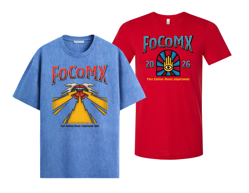
In addition to the modular frame system, we illustrated a powerful central image around two hands framing a mouth with lightning bolts and radiating soundwaves. This central image was our abstract way of communicating the “make your musical wish come true” concept in a way that combined the magical apothecary theme and psychedelic vibes we were going for. The hands symbolize FoCoMX as a musical gift to the community and the mouth represents artists finding and using their voices. We made sure the bolts broke out of the frame to help give them ultimate impact and really emphasize the power of music.
Once the primary designs were complete, we moved into creating t-shirts for both the public and volunteers. The FoCoMA team then took the system and applied it to wrist bands, ads, social media posts, and more. Bands also received a media kit they could use to promote their performance at FoCoMX.
After we built the whole brand theme and system, we moved into planning and creating our final piece of the puzzle: the window mural at Elevations Credit Union. The credit union would house the volunteer headquarters, so FoCoMA wanted a mural on the windows that matched the event branding. The mural was part art piece, part advertisement. We designed it as a paired-down evolution of the poster design, with relevant info about the event. It was a great experience to get out of the office and get our hands dirty.
The impact
FoCoMX 2026 was a huge success, with the event selling out for the first time and merch selling out within hours of the festival starting. But beyond the financial success, the event theme was a huge hit with the community and went on to be one of the most popular themes to date. When branding is done well, it’s not only something an audience buys into. It’s something they adopt and make their own. We saw bands, people, and local businesses taking the theme and making it their own left and right. From hand-drawn chalk menu signage using our modular system, to customized posters and other promotional assets using the illustrations, it was awe-inspiring to see how much the community bought into the concept and became part of it with us. As the designer/illustrator behind the work, this was what meant the most to me. To see my work being used as a vehicle to bring the community together in multiple meaningful ways: through music, art, and shared values.
It was my first time ever attending FoCoMX, and to see the town come alive in a way I haven’t seen before was amazing. But having been the one to create the artwork for the event made it even more special. I felt connected to it in a deeper way that gave me such immense pride. I was so proud of our team, the FoCoMA team, and everyone involved that brought the event to fruition. We love music, and we love our community. Being able to use our skills to help bring those things together in Fort Collins was such an honor and blessing. We can’t wait to be able to create more meaningful work like this with great people and organizations.