Please enjoy this guest spot blog from our Senior Designer and master of knowing what’s what in brand today, Paul Lukes!
— Bonfire Editorial Team
Rebrand, it's what's for dinner!
If you’ve been paying any attention at all, you’ve seen the uproar caused by the rebrand of the senior citizen hotspot, Cracker Barrel. The “Old Country Store” launched its new logo and full rebrand to widespread backlash due to the drastic changes to the logo. The new logo ditches the detailed illustration of the man, known as Uncle Herschel, as well as the barrel he relaxed against. Also absent from the new logo are the lima bean container shape and “Old Country Store” tagline beneath the logo. The updated logo retains some of the character of the typography with the C to B ligature and chunkier, flared serif typography. But the type alone is really all that remains from the previous logo and this is what has people up in arms, feeling like the soul of their ultra-beloved brand has been removed and they’re left with a lifeless skeleton. The backlash has been so drastic that the Cracker Barrel stock has plummeted substantially in recent days. And they say branding doesn’t matter! So, is this really a poorly executed rebrand and are the masses right in planning a revolt against their favorite spot for a 4 o’clock dinner? Let us explore that a bit.
Brand in context and for a new gen
First, let’s discuss what a brand and rebrand consist of, as it’s far more than just a logo. Cracker Barrel’s rebrand starts with the logo but expands to their website, in-store experiences and packaged goods. The logo is one piece, the top of the brand “family tree,” if you will. But the full brand story is told through the implementation across all touchpoints a potential customer may encounter. To evaluate the rebrand by only looking at the two logos (old and new) next to each other wouldn’t be looking at the full picture.
Secondly, let’s discuss who their audience was/is and who they want them to be in the near future. Cracker Barrel has had a primarily older market that they serve, people in their twilight years with leisure time to enjoy those early afternoon dinners before a night of intense bingo. The truth of that is these people won’t be around in 10 years, so Cracker Barrel has to think about where their future customers are going to come from. With this rebrand, they are doing a subtle positioning shift toward a younger, although not youth-based, market of customers—the kids of their current customers. People who are digitally savvy, but not so savvy that they have a TikTok account. This shift of positioning is everything with this rebrand. Without knowing this, the rebrand looks like an obvious fail.
Romanticizing nostalgia while keeping it cool
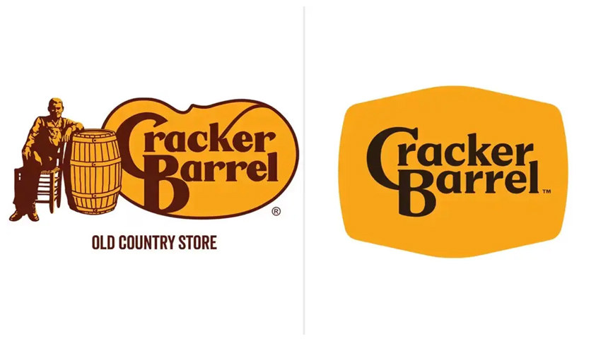
Taking these factors into account, let’s properly evaluate the new logo. Objectively, the new logo, while not being anything groundbreaking, is actually a good evolution. The type is cleaned up rather well, while maintaining some of its heritage with the aforementioned ligature. The new container shape is barrel-esque and contains the wordmark well. In losing “Uncle Herschel” and the barrel, the new logo becomes much more user friendly and versatile. Try taking the old logo and making it your profile image on Instagram and you’ll see why it wasn’t ideal. The old logo had far too much detail for it to be user friendly and scalable across all touchpoints.
While the new logo is functionally well designed, both in the full wordmark form as well as the CB monogram, it definitely lacks some of the warmth and soul of the original logo. Could they have redrawn Uncle Herschel or the barrel to create a new brand mark/icon to go along with the type? Yes, they could have. Maybe that would have satiated some of the loyalists’ hunger for the nostalgia baked into the old logo.
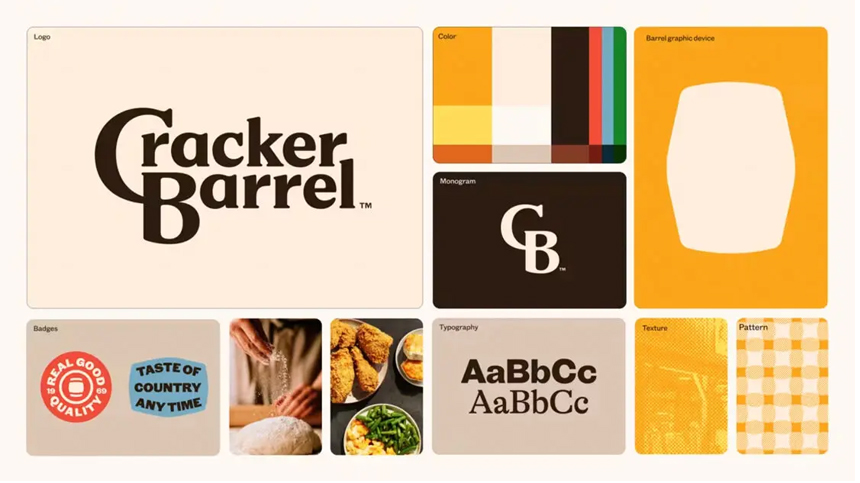
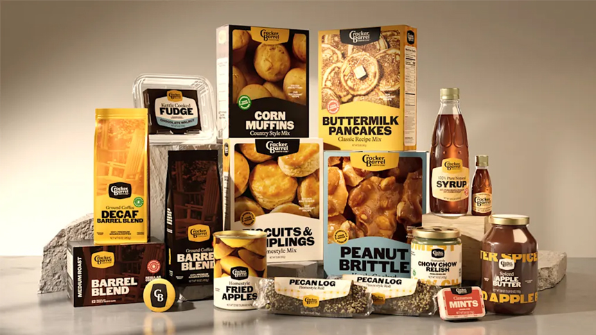
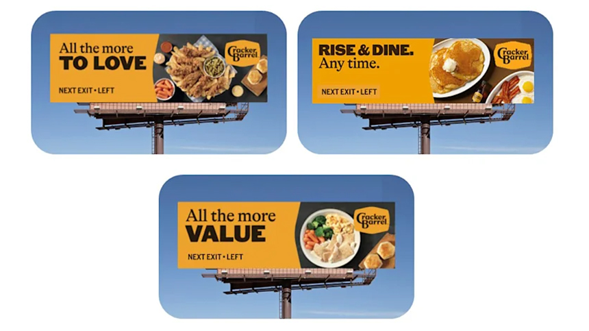
All that being said, when one takes a holistic view of the complete rebrand, from the logo to revised, higher contrast color palette, the plaid patterns and retro style packaging, things start to come together much more. The packaging is the star of the show here, created to look like something you’d find in an ad in an old magazine you come across at a yard sale. The items have modern elements, but somehow they’re put together with just the right amount of retro flare to feel like they could be on set in a Stranger Things episode. If the logo doesn’t feel nostalgic, then these turn nostalgia way up. In addition, the higher contrast color palette makes the brand far more accessible for anybody with any sort of disability and increased accessibility is always a win.
The patterns and secondary type choices reinforce this modern-nostalgia aesthetic, leaning into the digital first world we all live in now by using cues and subtleties to their advantage. This approach really brings home the nostalgia baked into the old brand. They even have Uncle Herschel appearing on menus and other touchpoints, so any of those people worked up about his loss can be reunited with their beloved unc.
Making the old new again
With audience and strategy in mind, I think this is actually a really solid and well executed rebrand for a brand that, like its audience, may not have been around much longer if they had not adapted to the digital first world, where more people are likely to have a guy on their scooter bring them a sandwich than they are to venture out to the “Old Country Store.” This rebrand makes the brand accessible to a new generation so they can go there with their parents now, and go there to remember their parents later.