SERVICES
- Brand Positioning
- Brand Messaging
- Logo Design
- Visual Identity
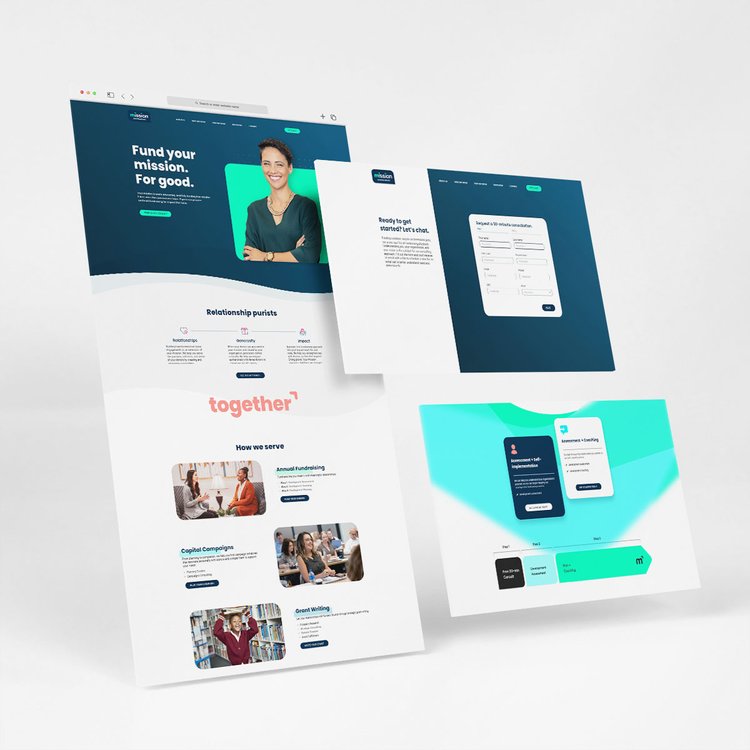
- Website UX / UI
Challenge
In the attention economy, non-profits need more than big-tent galas to hit their fundraising goals. They are looking for unique, people-centric ideas to supplement their fundraising efforts—and advance their causes.
Mission Advancement understands this. And they live it. They pride themselves on being relationship experts who can make things happen, and look beyond traditional approaches.
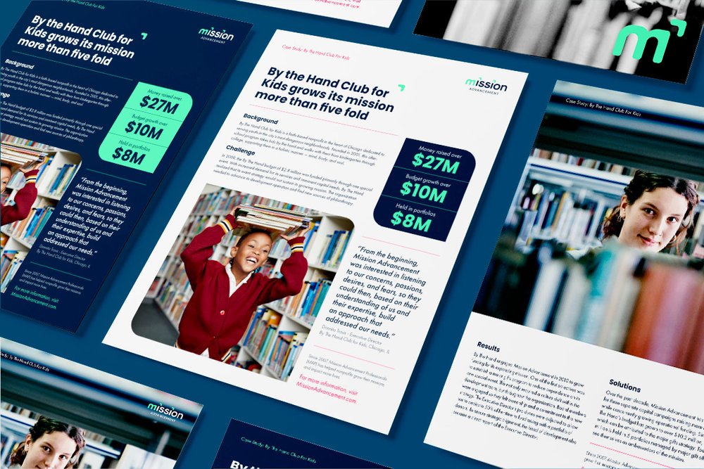
Yet their brand identity looked and felt similar to their rivals. And internal and external confusion swirled around an acronym associated with their name. Mission Advancement initially approached Bonfire Effect to develop a lead-generation campaign. But as we dug into the situation, it became clear that the first step in their lead-gen goals would be to establish a clarified brand position and a fresh, more youthful brand identity.
Solution
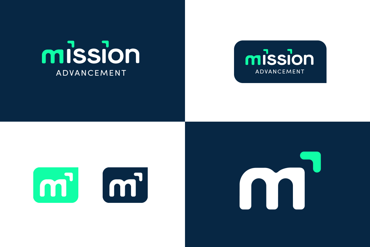
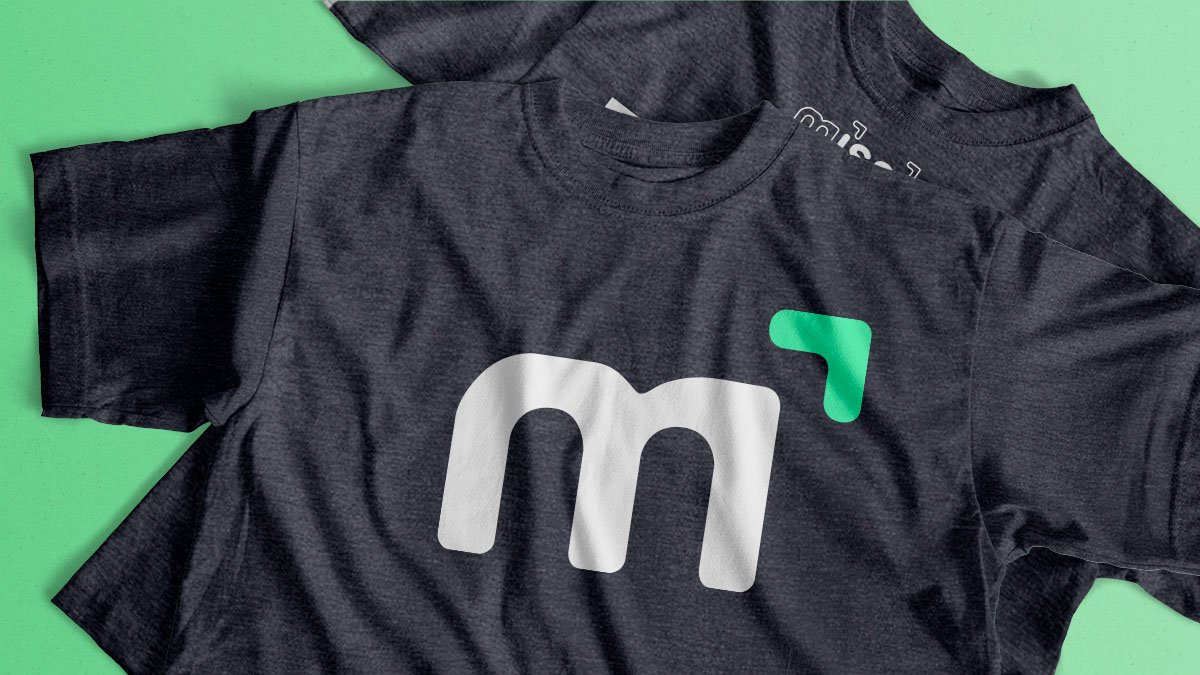
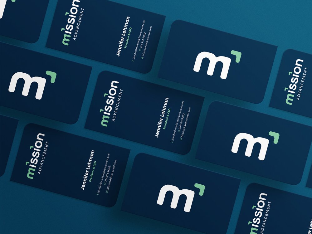
Our creative strategy centered on two elements: relationships and a sense of forward progress. This came to life in the logo: the two dots over the “i”s in “mission” resemble an arrow. And in the simplified logo mark, the highlighted arrow signifies that the mission as a non-profit is always advancing.
We highlighted their expertise in relationship-building in their positioning statement and brand narrative. And then embodied that story in the redesign of the website. We implemented a user-centric design that emphasized ease of navigation and showcased the company’s robust resource hub.

